Lume
Timeline: April - May 2025 (2 months)
PROBLEM
Many users struggle with staying organized and motivated when managing tasks
Many users struggle to stay organized and motivated when managing tasks across school, work, and personal responsibilities. As a university student balancing classes and a part time job, I often found traditional to do apps overwhelming and uninspiring. Long task lists and rigid structures made it difficult to stay engaged over time
Students and young professionals want tools that help them stay organized while also providing a sense of progress, momentum, and achievement
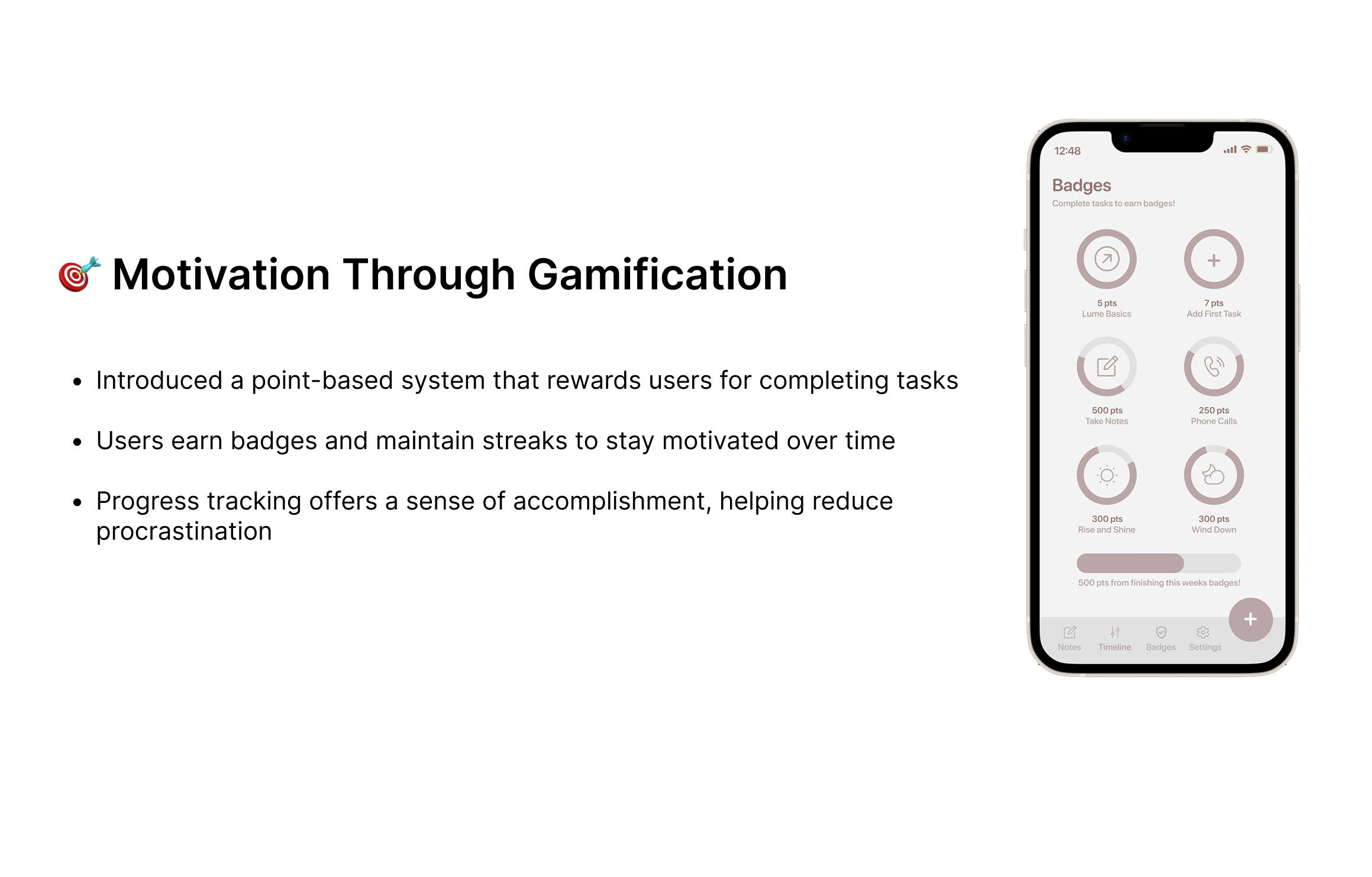
The Solution
Designing for Motivation and Momentum


Competitive Analysis + The Gap
Beyond the Competition: Finding the Missing Piece
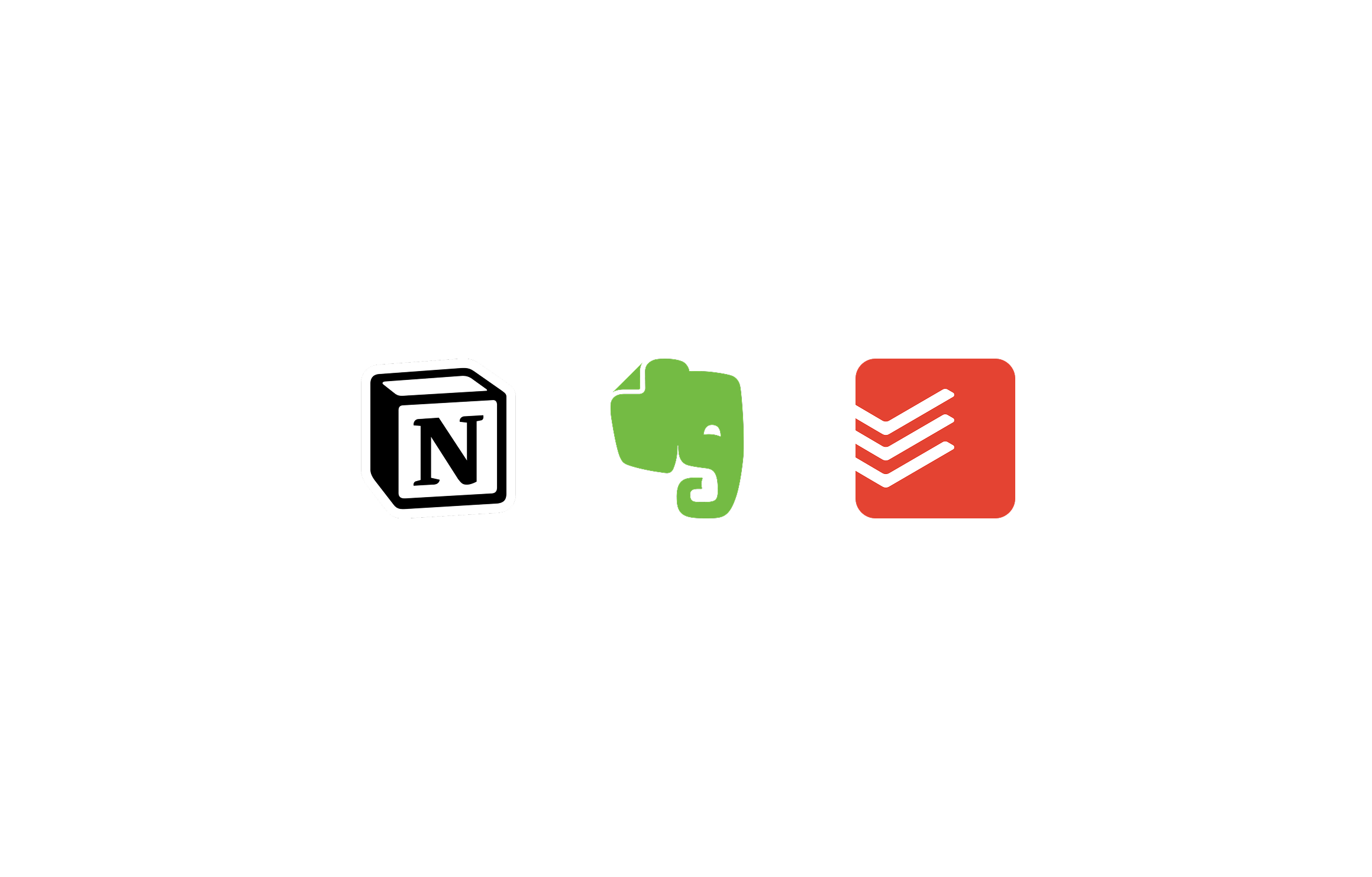
I analyzed three popular productivity tools: Notion, Evernote, and Todoist. Each excels in a specific area, but none fully address both organization and motivation in a single, seamless experience
Notion offers flexibility but can feel complex and time consuming to set up
Evernote supports freeform note taking but lacks strong task prioritization
Todoist excels at task management but offers limited flexibility for capturing ideas
Opportunity: Design a product that allows users to capture ideas in multiple formats, quickly convert them into tasks, and stay motivated through visible progress and rewards
User interviews
Listening to Real Voices: Insights from Student Interviews
I conducted interviews with four students from the University of Washington who frequently struggled to complete assignments and manage deadlines. Through guided questions, I explored how they currently organized tasks, what caused them to fall behind, and what helped them feel motivated

Key insights:
Users rely on multiple apps for notes and tasks, creating fragmentation
Long task lists without clear priorities increase stress and avoidance
Complex interfaces discourage consistent use
Visual indicators of progress help users feel more motivated
These insights shaped how Lume organizes tasks, surfaces priorities, and presents progress
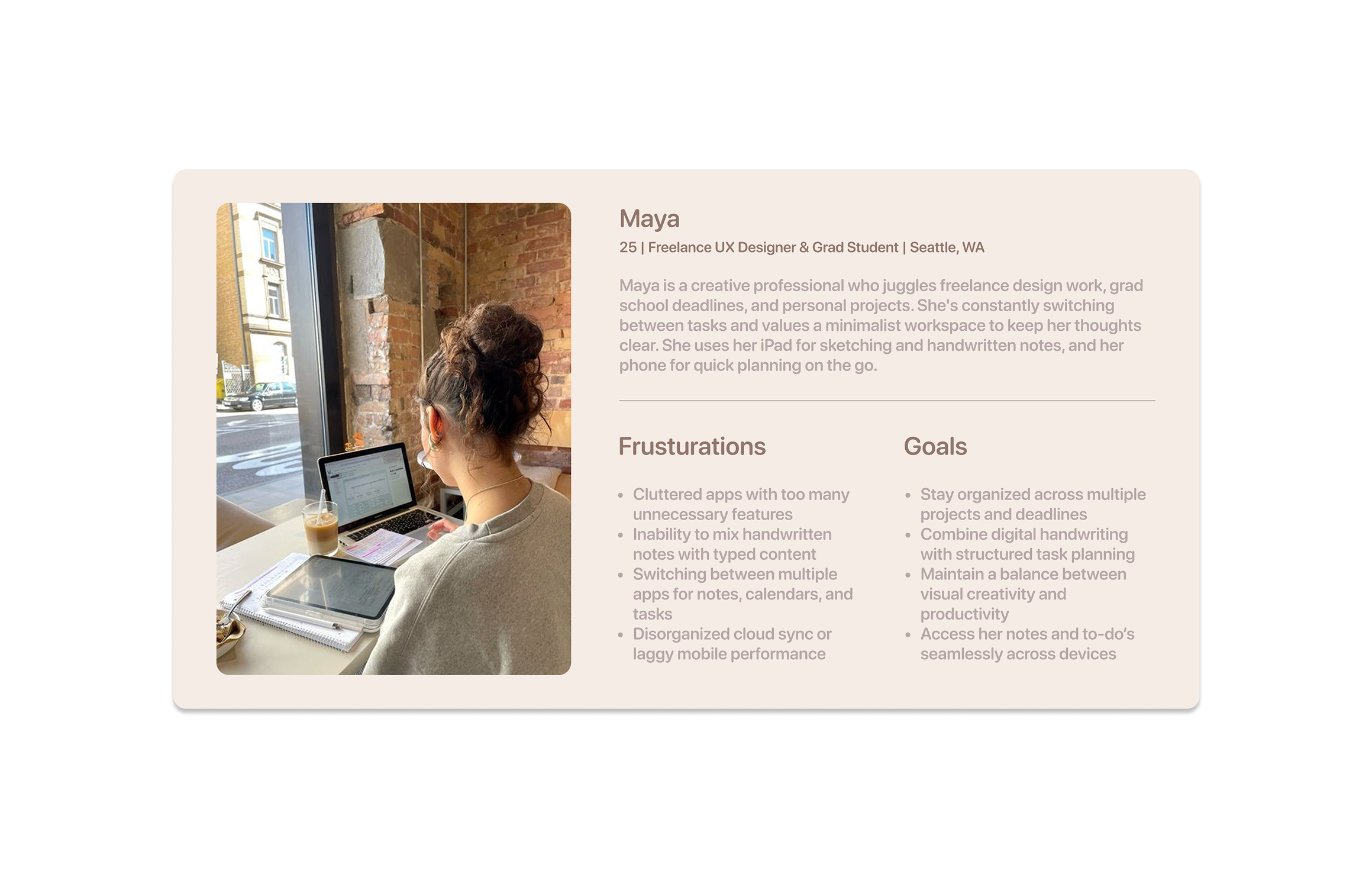
User persona
Designing with Empathy
Based on interview patterns, I created a primary user persona to guide design decisions.
Maya is a graduate student juggling coursework, deadlines, and personal responsibilities. She wants a system that feels flexible and forgiving, allowing her to organize tasks in her own way while still providing structure and motivation.
This persona helped ensure that the experience prioritized clarity, emotional comfort, and ease of use.
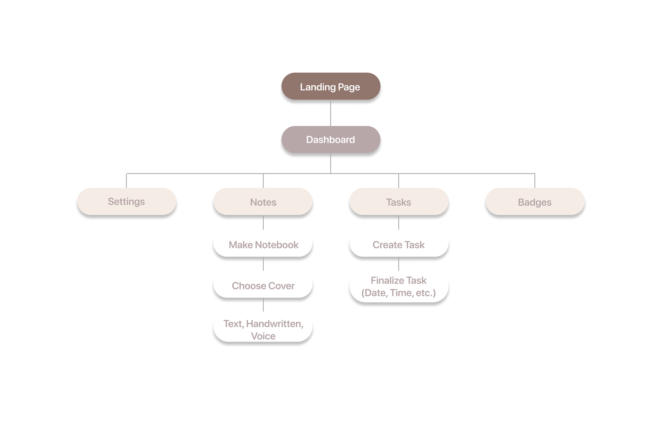
User Flow
Mapping the Journey
To understand how users would move through the app, I created a user flow outlining key actions, from capturing a note to completing a task and earning points. Mapping this journey helped identify opportunities to simplify navigation and reduce friction, particularly during task creation and review
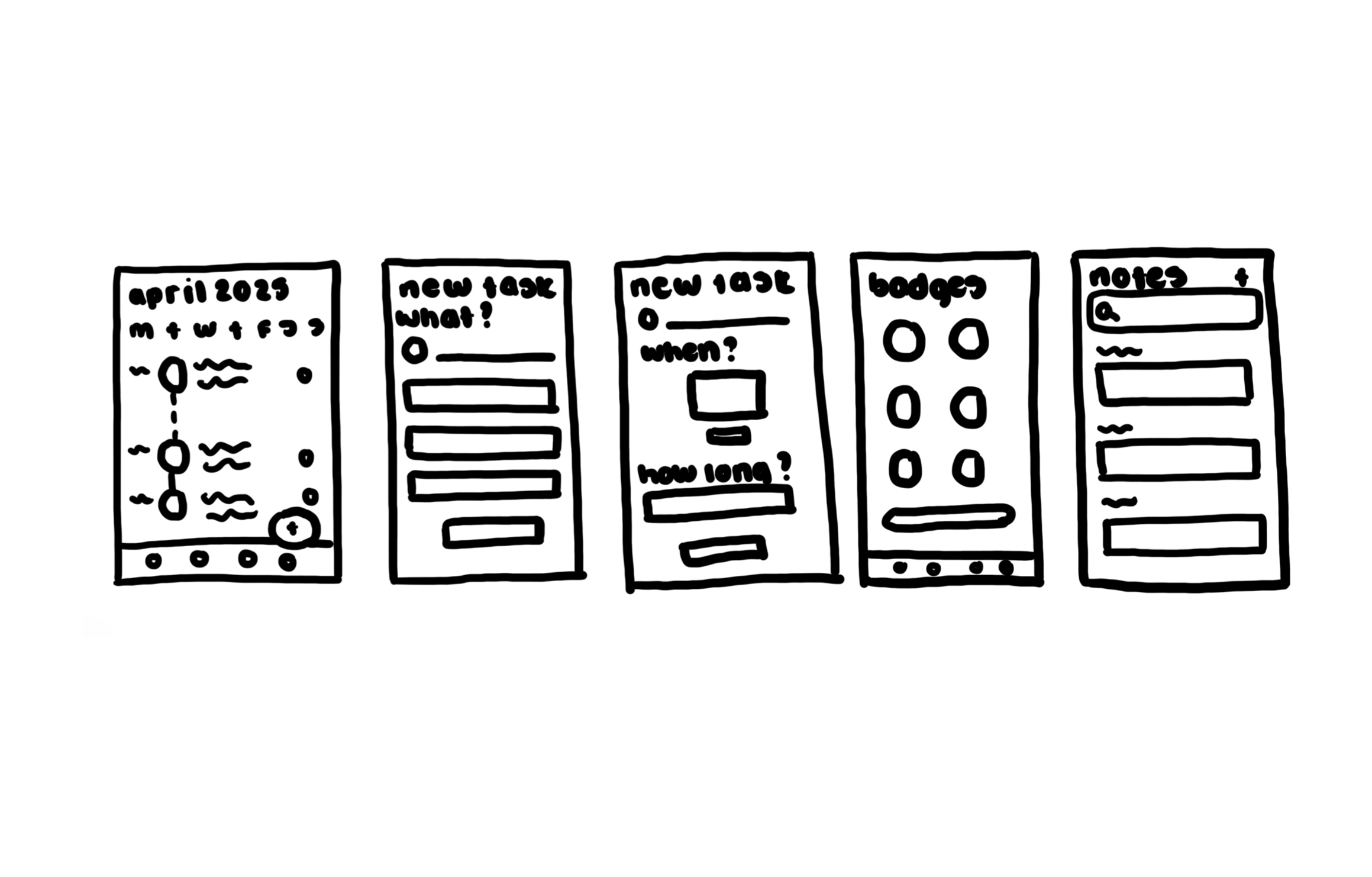
Paper Wireframes
Sketching to Solve
I began with rapid paper sketches to explore layout ideas and interaction patterns. Working in low fidelity allowed me to test different ways of organizing notes, tasks, and progress indicators before committing to digital designs
This phase helped clarify how much information should appear on the main dashboard versus secondary screens
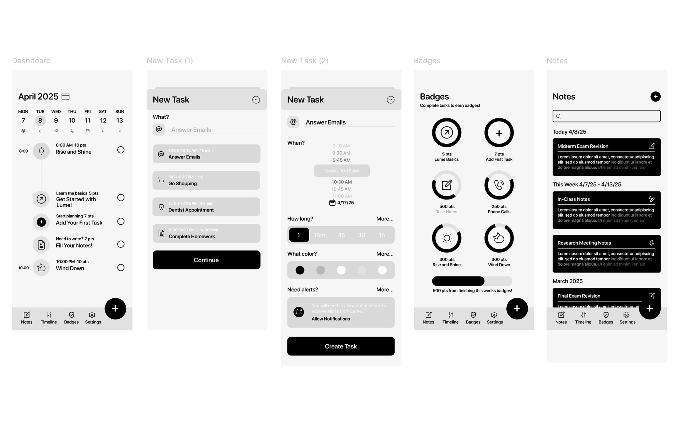
Digital Wireframes
Structuring the Experience
After refining my sketches, I translated them into digital wireframes with a focus on clarity and usability. I prioritized simple task creation, easy access to notes, and clear visibility of progress
Design decisions were made to reduce cognitive load and help users quickly understand what needed attention
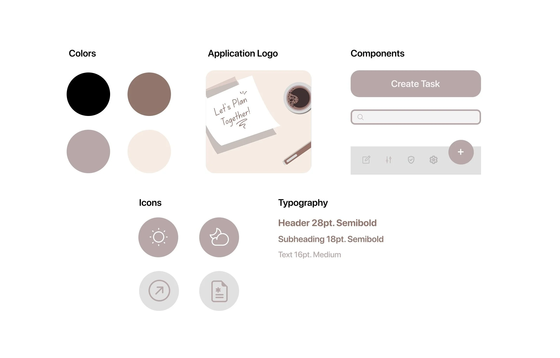
UI Kit
Building the Visual Language
I created a UI kit to maintain consistency across the app. The system includes typography, color styles, button components, and icons designed for mobile accessibility and a clean, modern feel.
Visual choices were intentionally minimal to avoid distraction while still feeling friendly and encouraging
User Testing + Iterations
Refine, Test, Repeat
I conducted usability testing with four participants and asked them to complete key tasks such as creating a note, converting it into a task, and reviewing progress.
Key findings:
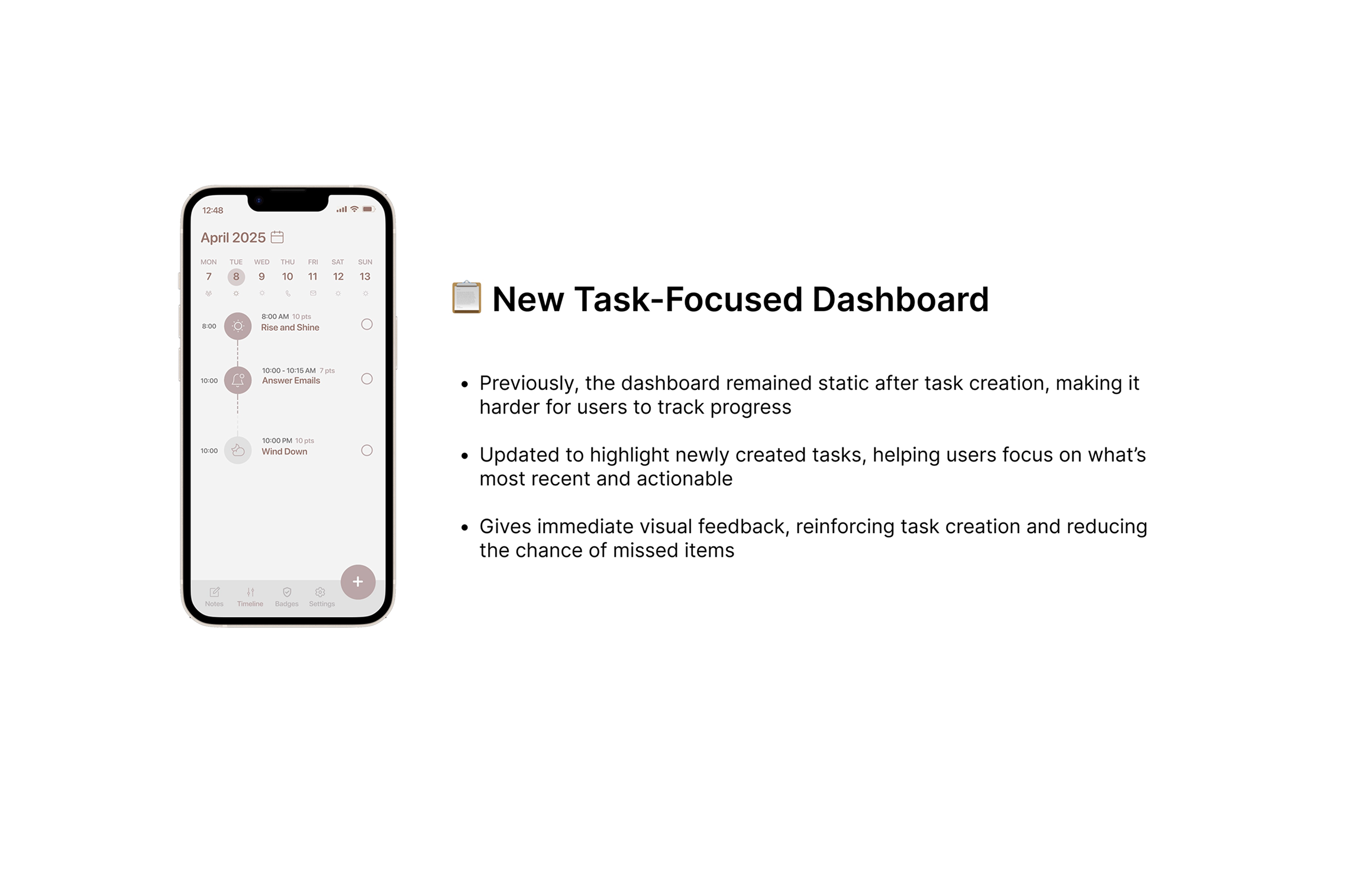
Users felt overwhelmed when all tasks were displayed at once
Progress indicators were easy to understand but initially overlooked
Iterations:
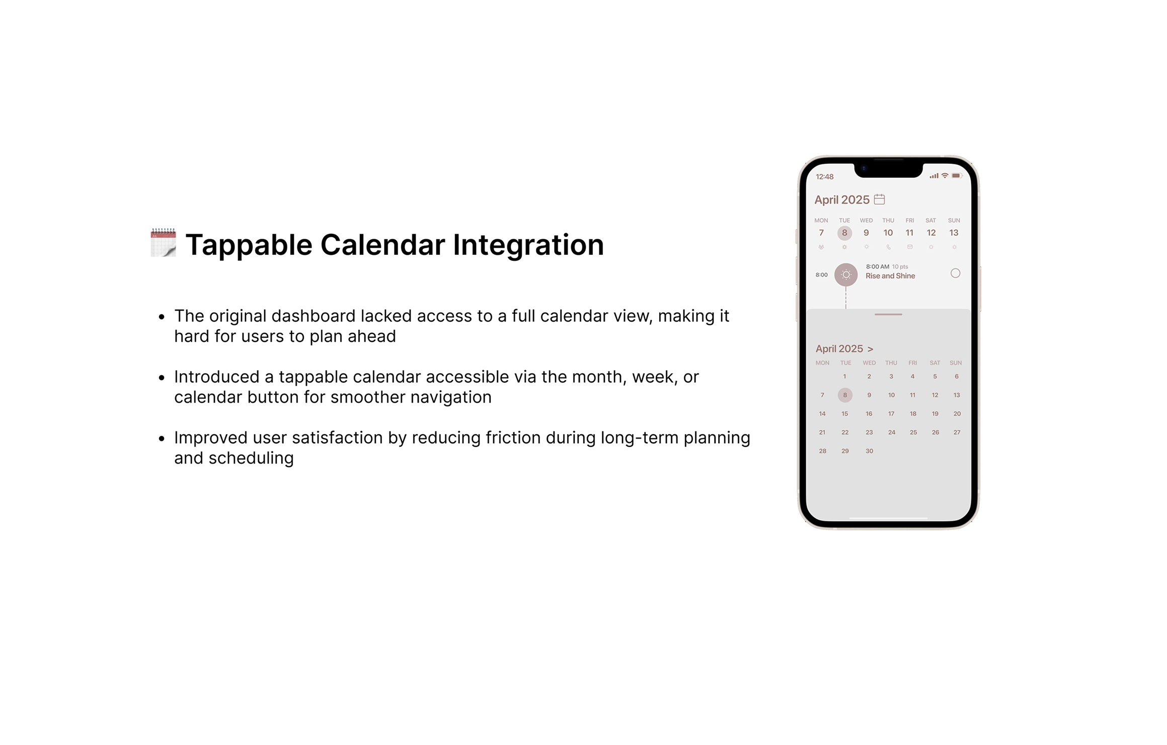
I refined the dashboard to surface new and high priority tasks first
Progress indicators were moved into more prominent locations to reinforce motivation
These changes helped users feel more focused and aware of their progress
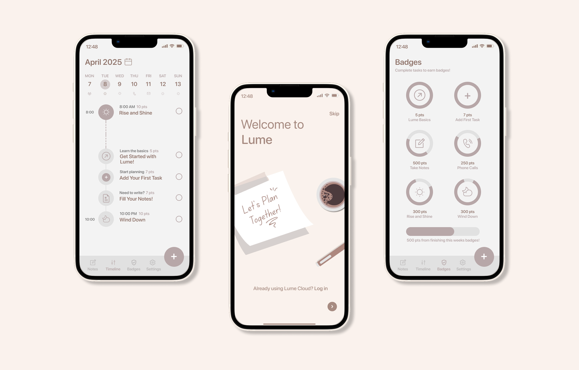
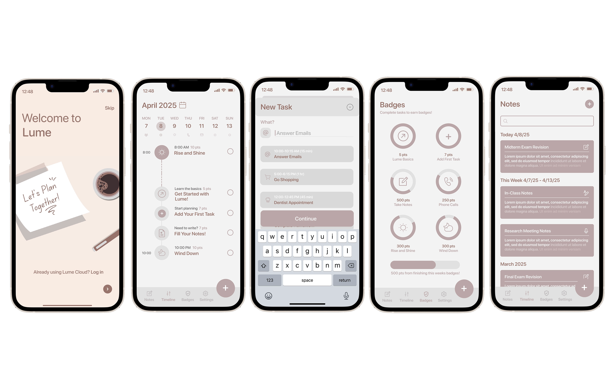
The final screens
The Final Product
Conclusions + Lessons Learned
The Takeaway Trail
Designing Lume highlighted the importance of balancing flexibility with simplicity. Small design decisions, such as surfacing priority tasks and integrating progress indicators into the dashboard, had a meaningful impact on how users felt about managing their workload
Key takeaways:
User feedback revealed hidden sources of task overwhelm
Motivation works best when progress is visible but not demanding
Thoughtful details like clear hierarchy and responsive interactions improve engagement
This project strengthened my belief that effective UX design comes from empathy, iteration, and a deep understanding of user habits