Brewway
Timeline: June - September 2025 (3 months)
Problem
Too Many Cafés, Not Enough Clarity
As someone who frequently visits cafés, I noticed how overwhelming it can be to choose the right one. While there are plenty of options, existing tools often surface the same popular spots without accounting for why someone is visiting, whether they want a quiet place to study, a social environment, or a quick grab and go stop
This leads to:
Review overload
Inconsistent or outdated information
Low confidence in choosing a café that fits the moment
solution
AI That Knows Your Taste
COMPETITIVE ANALYSIS + THE GAP
Beyond Maps and Reviews: The Missing Ingredient
I analyzed platforms such as Google Maps and Yelp to understand how users currently discover cafés. While these tools excel at location based discovery and reviews, they fall short in several areas
Recommendations are largely generic
Personal preferences are not meaningfully integrated
Vibe and context are buried in long reviews rather than surfaced clearly
Opportunity: Design a discovery experience that blends personalization, vibe based filtering, and clarity to reduce the need to cross check multiple apps
user interview
Brewing Insights from Real Café Lovers
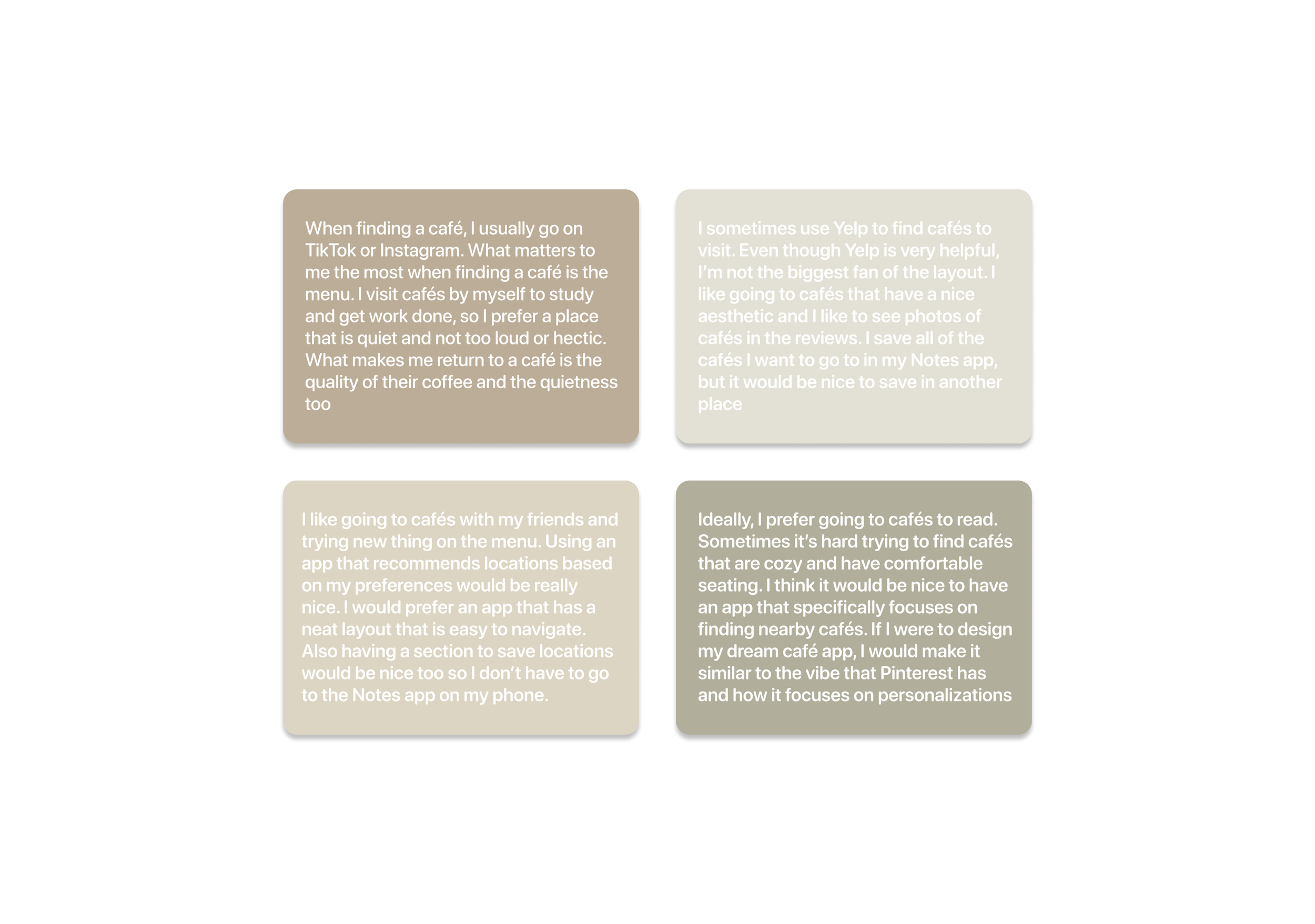
Through interviews with students and young professionals, I learned that people want cafés for specific contexts like studying, socializing, or a quick grab-and-go, but struggle with review overload and inconsistent info. Users also value vibe (quiet, cozy, aesthetic) as much as menu quality
Key insights:
People choose cafés based on context such as studying, socializing, or quick visits
Users feel overwhelmed by long reviews and inconsistent information
Vibe attributes like quiet, cozy, or aesthetic matter as much as menu quality
Users want faster confidence in their choice without excessive scrolling
These insights directly informed how information would be structured and prioritized in the design
user persona
Designing for the Everyday Explorer
To keep user needs central throughout the project, I created a primary persona based on interview patterns. This persona guided decisions around personalization, information hierarchy, and feature prioritization
Paper Wireframes
Sketching to Solve
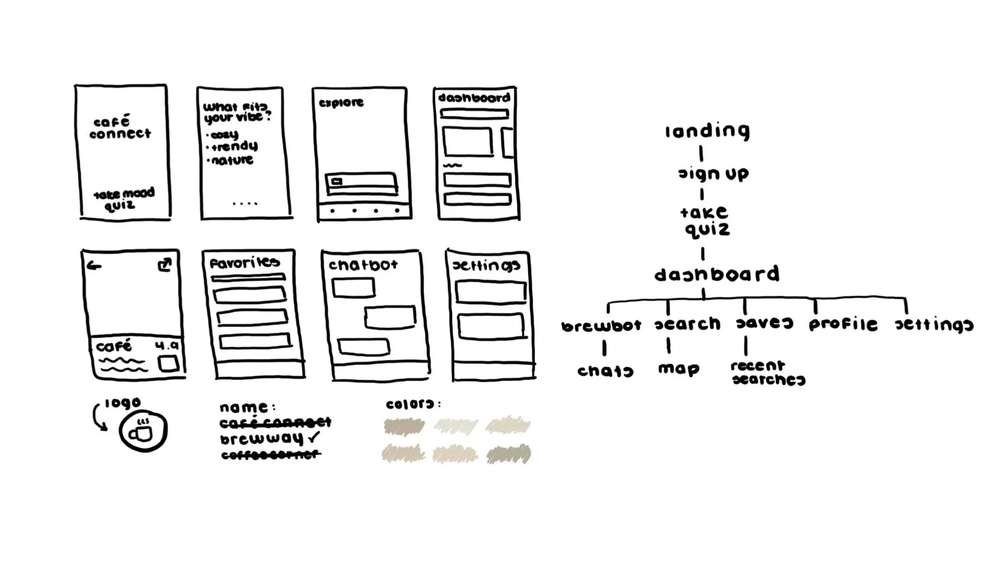
I began with rapid paper sketches to explore layout ideas and interaction flows. Working in low fidelity allowed me to test multiple concepts for search results, café profiles, and AI driven recommendations without getting attached to visuals too early.
This phase helped clarify which information needed to be immediately visible and which could remain secondary.
wireframes
From Sketches to Sips
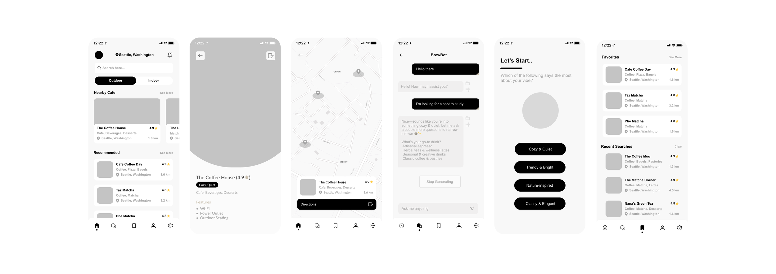
Moving from paper to digital wireframes, I focused on clarity and scannability. Key café details such as vibe tags, amenities, distance, and context suitability were surfaced upfront to reduce cognitive load
The goal was to help users quickly assess whether a café fit their needs without digging through reviews
ui kit
Crafting a Visual Flavor
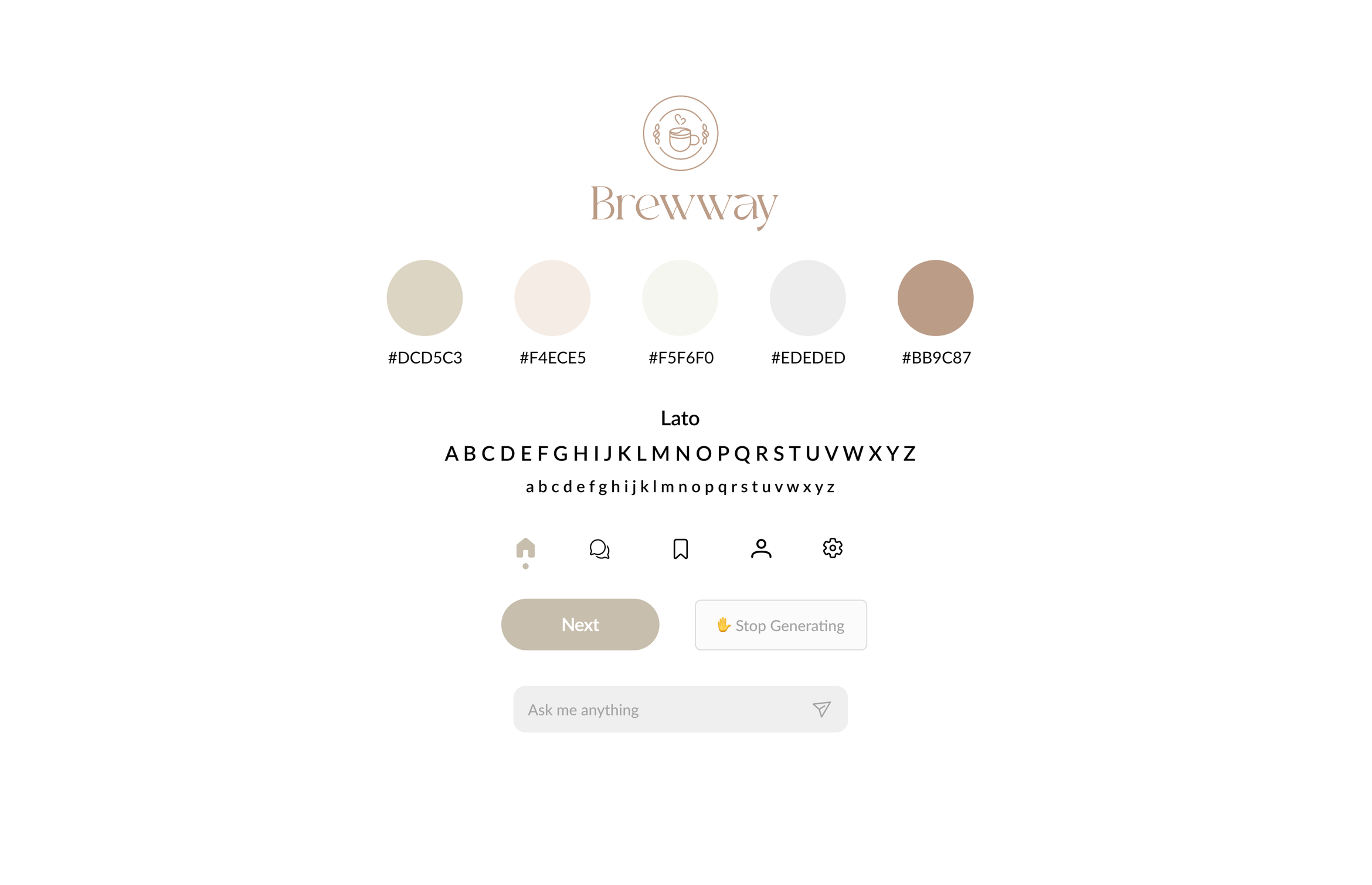
The UI kit established a warm café inspired visual language using rounded typography, soft colors, and clean components. Visual decisions reinforced a feeling of comfort and approachability while maintaining consistency across screens
The system was designed to scale as the product expanded to additional platforms
User testing + iterations
Taste Testing the Experience
I tested the mobile prototype with four users and asked them to complete key tasks such as finding a café for studying and saving a location for later
Findings:
Users found the mobile experience intuitive and easy to navigate
Multiple participants expressed interest in viewing café information on a larger screen when planning ahead
This feedback revealed an opportunity to extend the experience beyond mobile
Iteration:
Based on this insight, I spent the following two weeks wireframing and designing a responsive desktop version to support planning and cross device use
FINAL SCREENS
The Perfect Blend
The final design delivers a clean, intuitive experience where users can:
Discover cafés through personalized AI suggestions
Quickly assess vibe and suitability
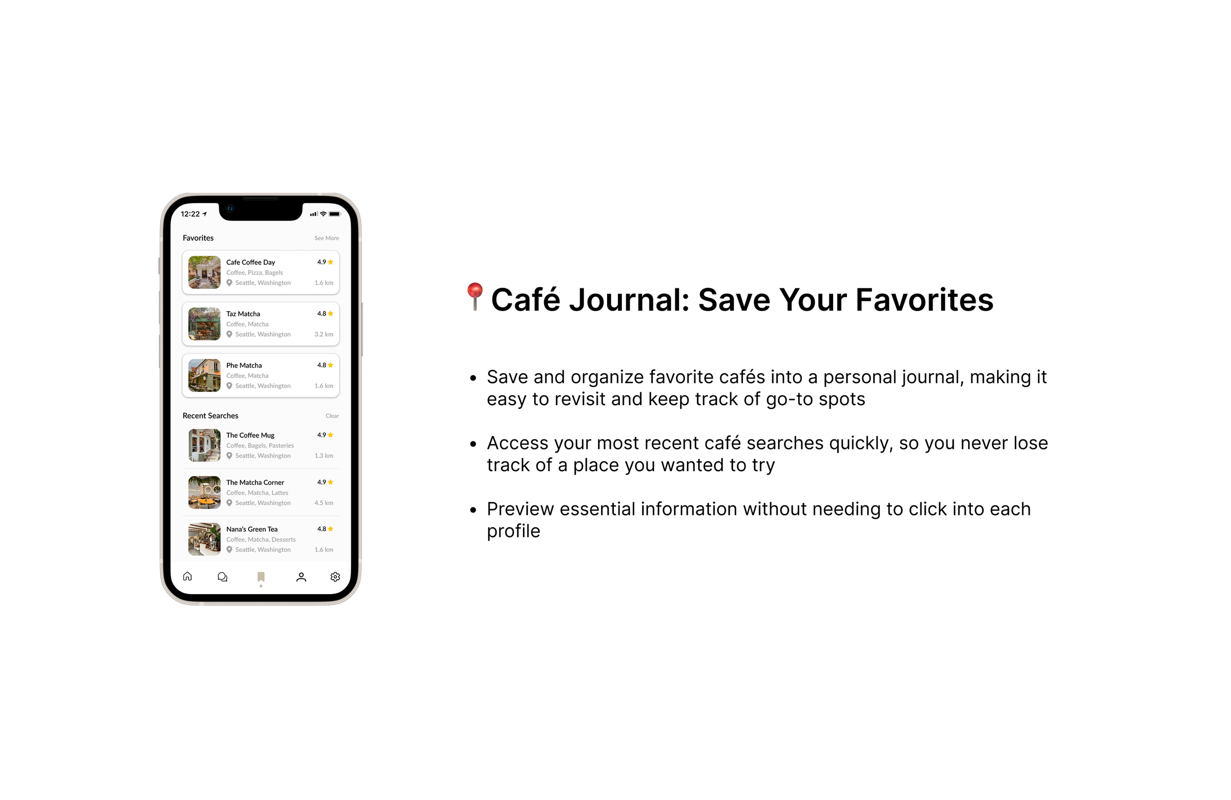
Save cafés for future visits
Access café information across mobile and desktop
CONCLUSION + LESSONS LEARNED
Brewing Better Experiences
Designing Brewway reinforced the importance of listening closely to even small pieces of feedback. One suggestion, access to café information on desktop, meaningfully shaped the next phase of the project
Key takeaways:
Positive validation confirmed that the mobile experience was intuitive and enjoyable
A single insight can drive meaningful impact
Designing across devices highlighted the importance of flexible and responsive systems
If I were to continue this project, I would further refine the desktop experience and deepen personalization to create a seamless cross platform journey


