BeReal Product Management Externship
Timeline: October 2025 - December 2025
Role: Product Management Extern (UX & Feature Design)
Disclaimer: This project was completed as part of a conceptual externship with BeReal, where students design and present ideas but do not modify the live app
Problem
Defining the Engagement Gap
BeReal encourages authenticity by prompting users to post once per day. While users can post more than once, engagement drops sharply after the daily prompt. The goal was to encourage authentic interactions beyond that peak moment
How might BeReal create additional moments of engagement without introducing addictive, competitive, or performative behaviors?
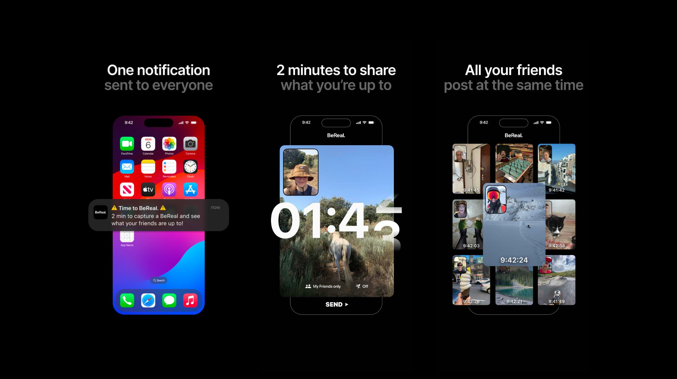
Immersing in the brand, mission & metrics
Getting Real with BeReal
Before conducting user research and engaging in the design process, I wanted to immerse myself in BeReal’s Brand Media Kit to establish clear design constraints
Non‑Negotiable Brand Principles:
Authentic, unfiltered moments
Intentional and meaningful social interaction
No algorithms, streaks, or influencer culture
Minimalist UI with low cognitive load
These principles served as guardrails for all product decisions
competitive analysis
Borrowing Without Becoming
I analyzed social media platforms like Snapchat and Instagram to understand how they retain engagement. Snapchat and Instagram demonstrate strong performance in:
Multiple content formats
Continuous interaction loops
Familiar social behaviors
Opportunity: BeReal doesn’t need more content. It needs more ways to express moments that preserve authenticity
user research
Listening Before Designing
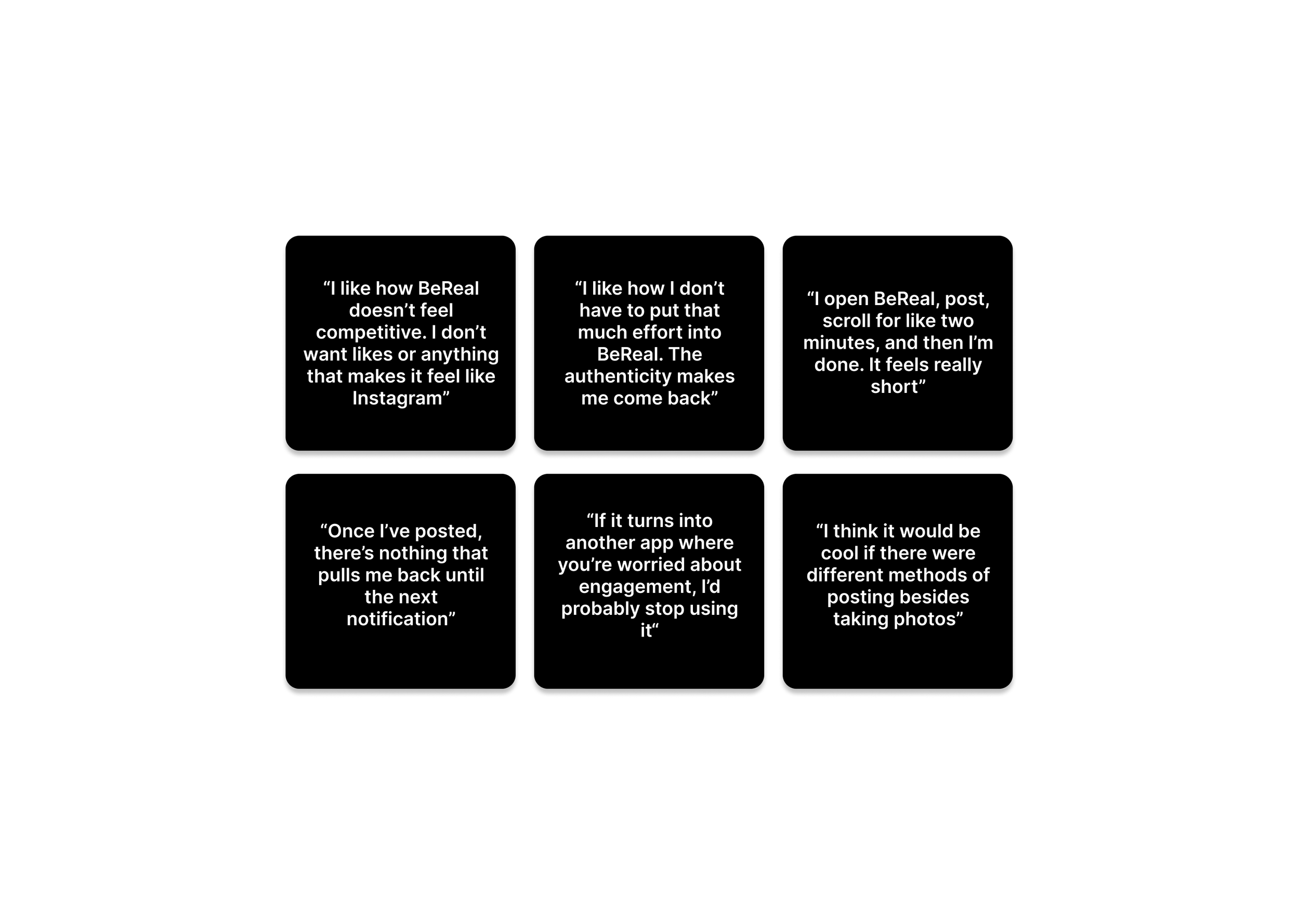
Because ~43% of BeReal’s users are ages 16–25, the research focused on this demographic with 10 participants through surveys and interviews to identify engagement drop-off moments and understand what motivates low-effort participation
Key Insights
Users value BeReal because it doesn’t feel competitive
Minimal effort is essential for sustained engagement
Users want ways to participate in other ways besides taking photos
This directly shaped the feature direction around reflection, storytelling, and casual check‑ins
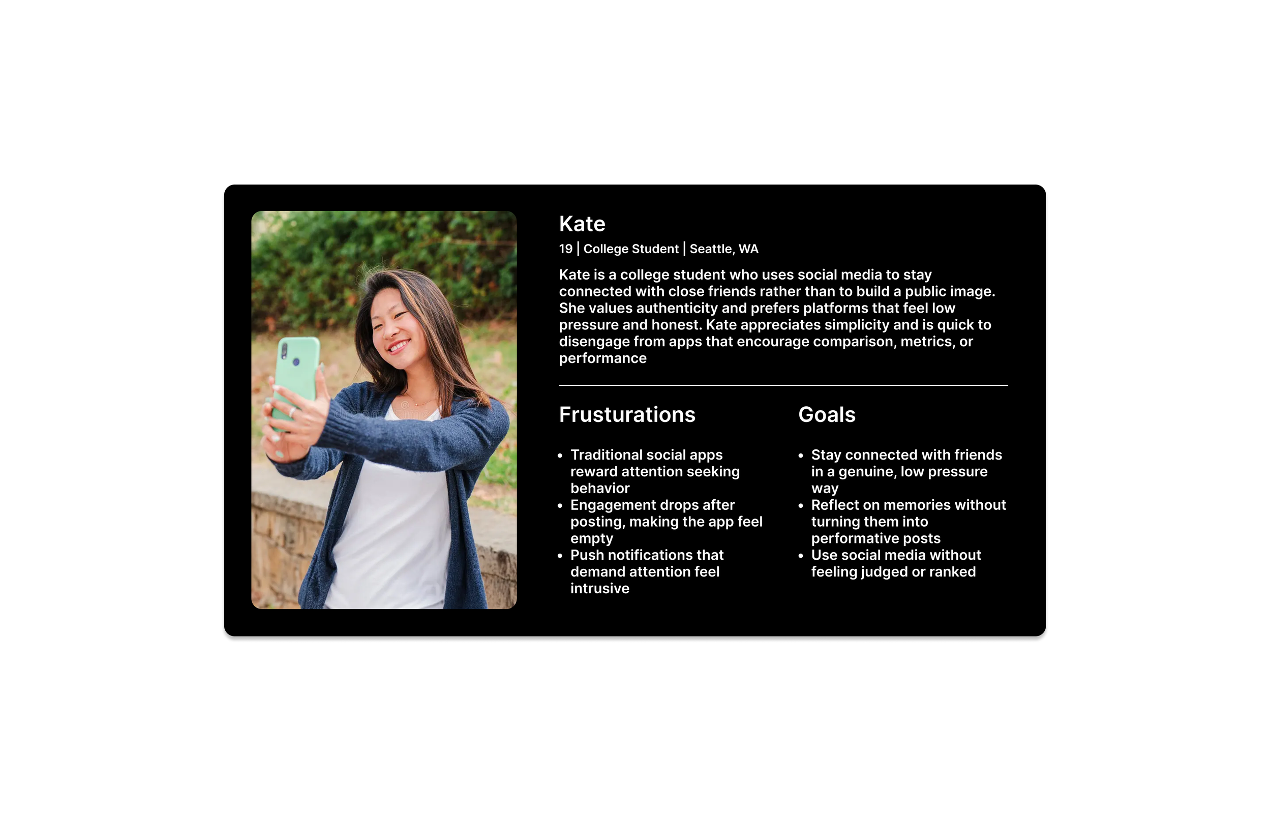
user persona
Designing for the Heart of BeReal’s Audience
To ground design decisions, I created a persona based on research insights.This persona kept myself focused on low‑effort, emotionally flexible participation
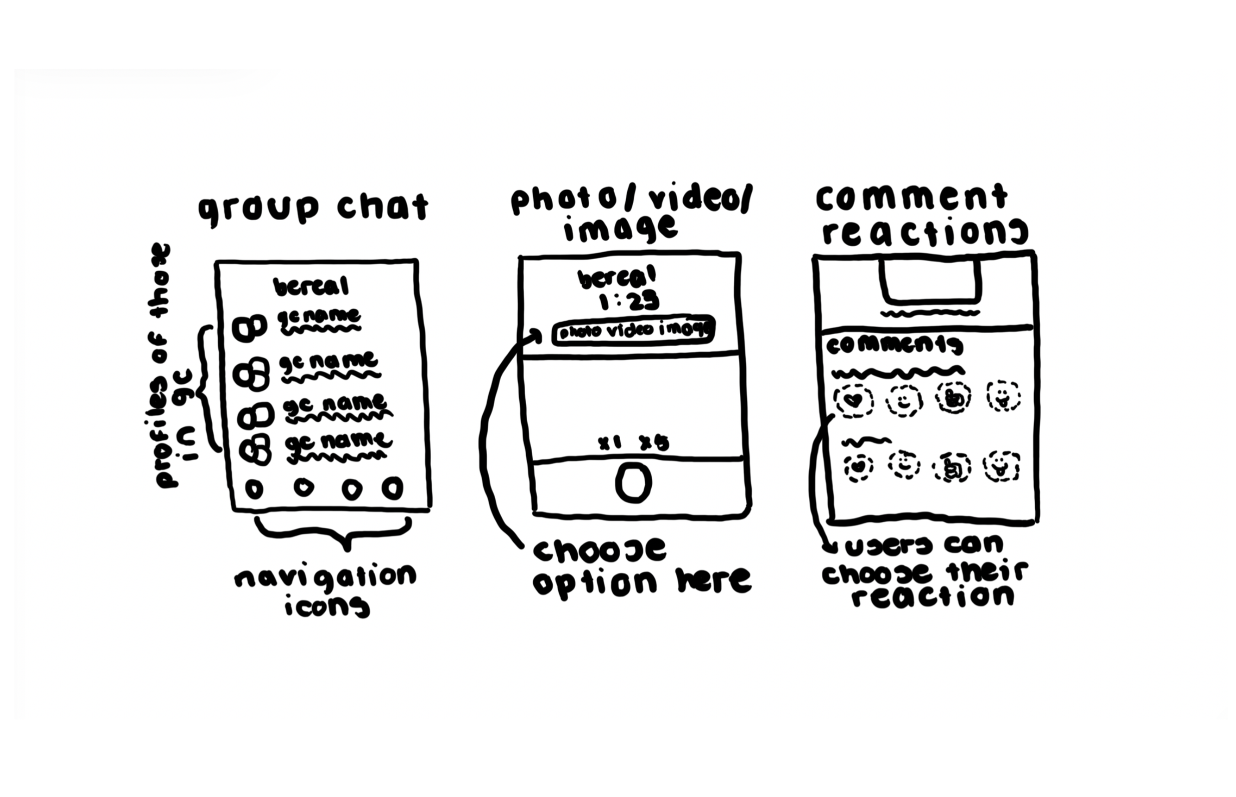
paper Wireframes
Sketching the Possibilites
Before opening Figma, I explored multiple concepts using paper sketches. This phase helped identify high-potential concepts early, reducing wasted design time and ensuring alignment with BeReal’s user-first philosophy
I returned to the focus group to validate direction. Users overwhelmingly favored multiple content formats to share their moment in different ways, reinforcing alignment with real needs
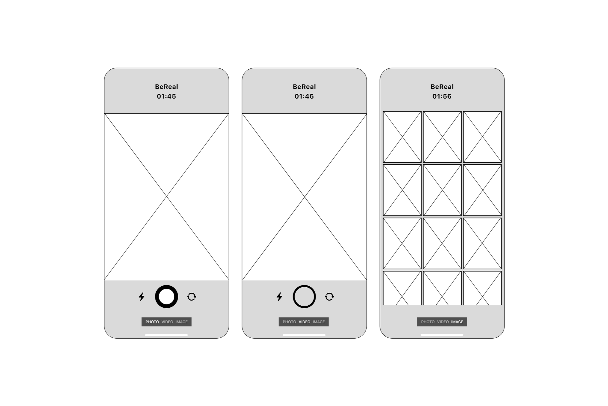
Digital Wireframes
From Paper to Pixels: Catering to the Main Flow
I translated paper sketches into Figma wireframes, maintaining fidelity to both UX and BeReal’s visual identity. Every spacing, icon choice, and interaction flow was carefully considered to reflect BeReal’s minimalist and authentic aesthetic
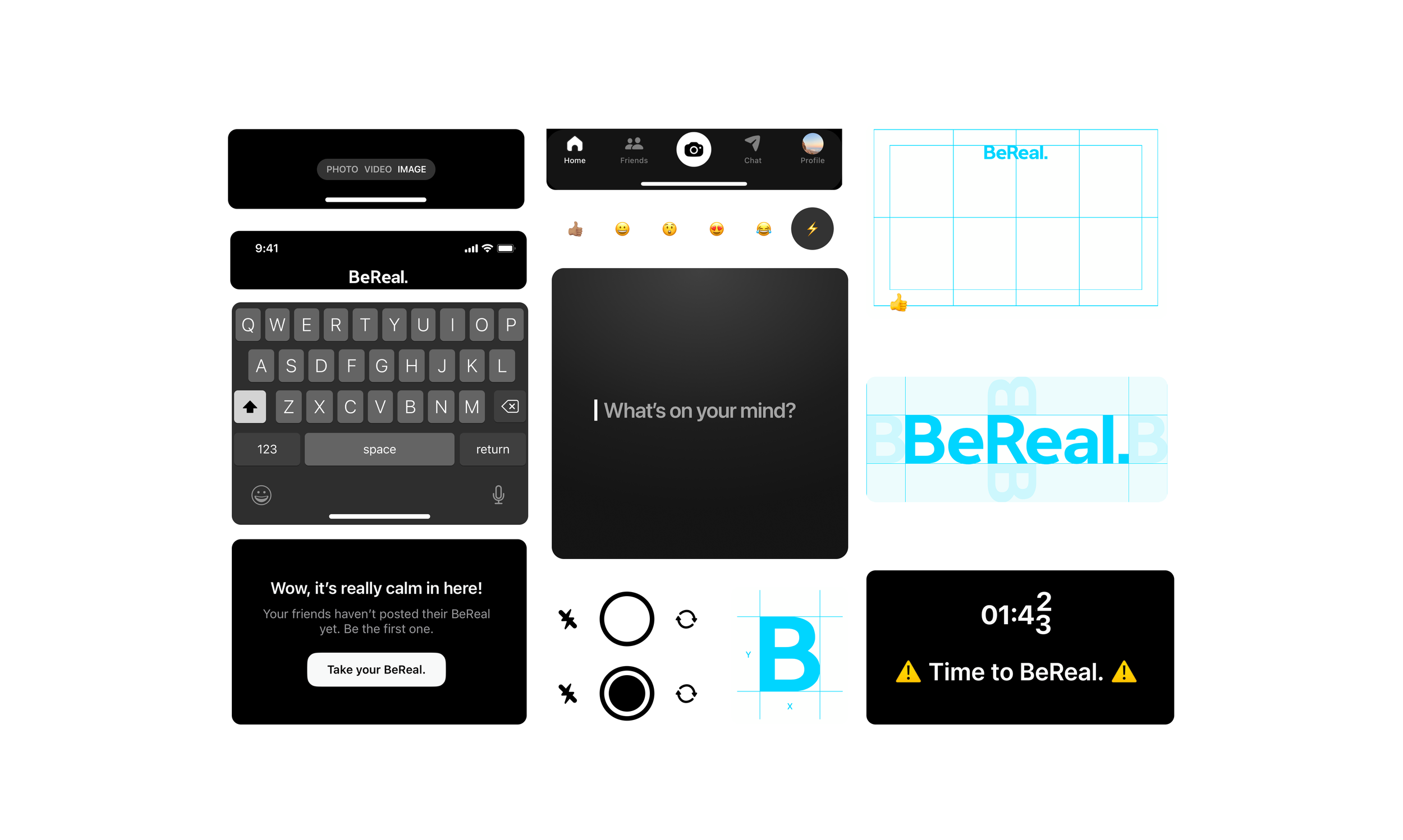
Branding + UI Kit
Designing With the Brand in Mind
To support scalability and stakeholder clarity, I created a small UI kit outlining typography usage, iconography rules, and color and spacing guidelines. This ensured new features expanded engagement without compromising brand integrity
Usability Test + Iterations
Testing, Tweaking, and Perfections
To validate design choices, I gained feedback from the research focus group. Iterative testing helped ensure the features were aligned with real user behaviors and expectations.
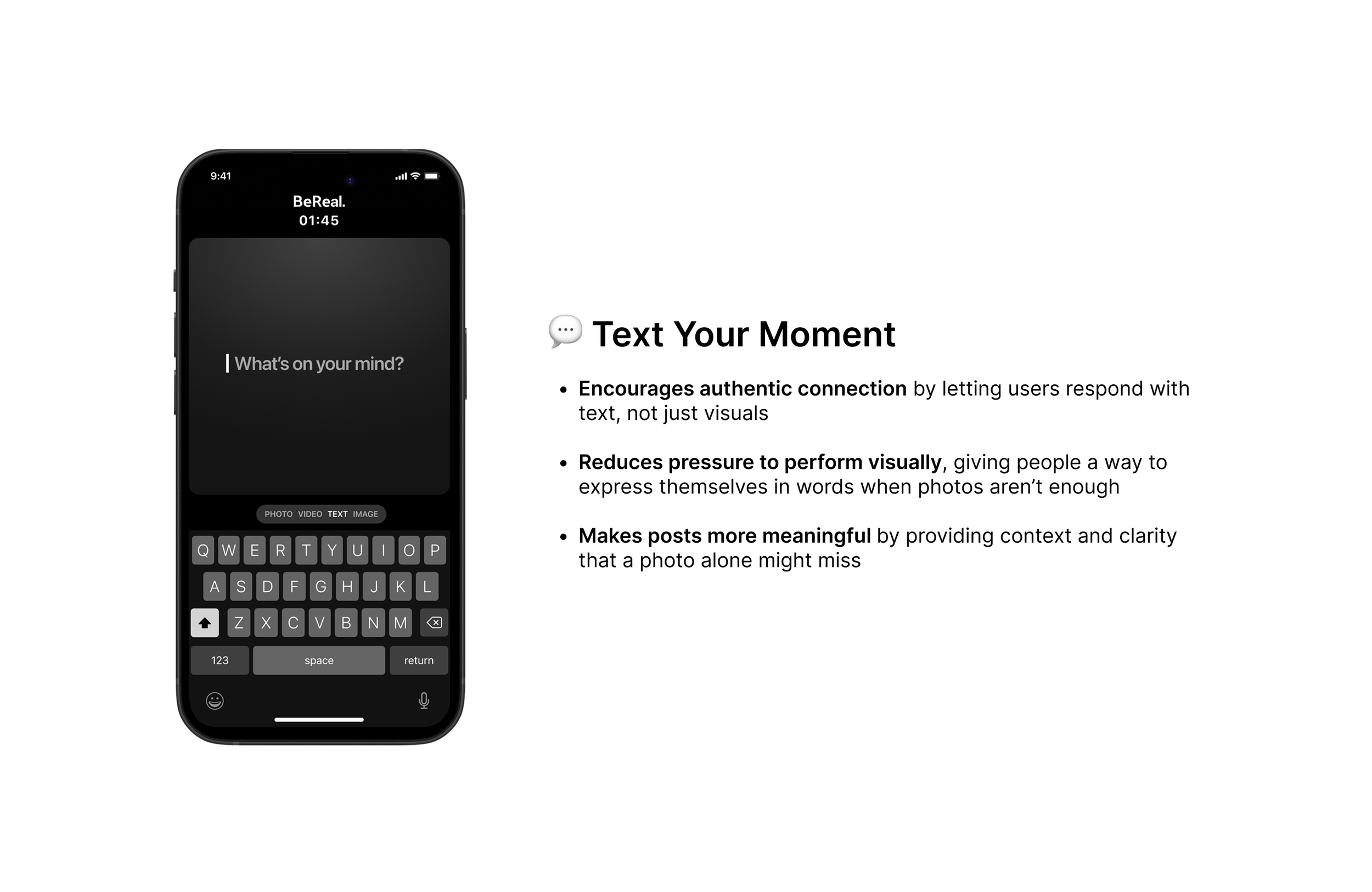
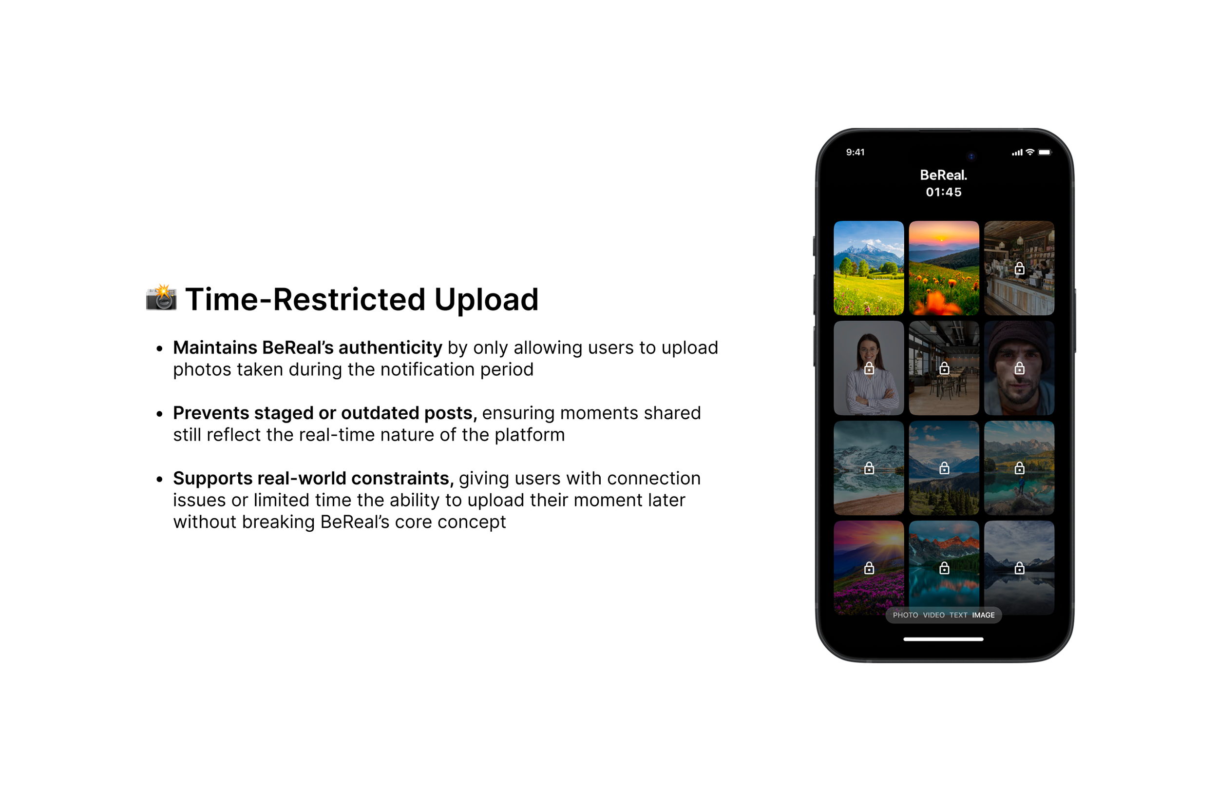
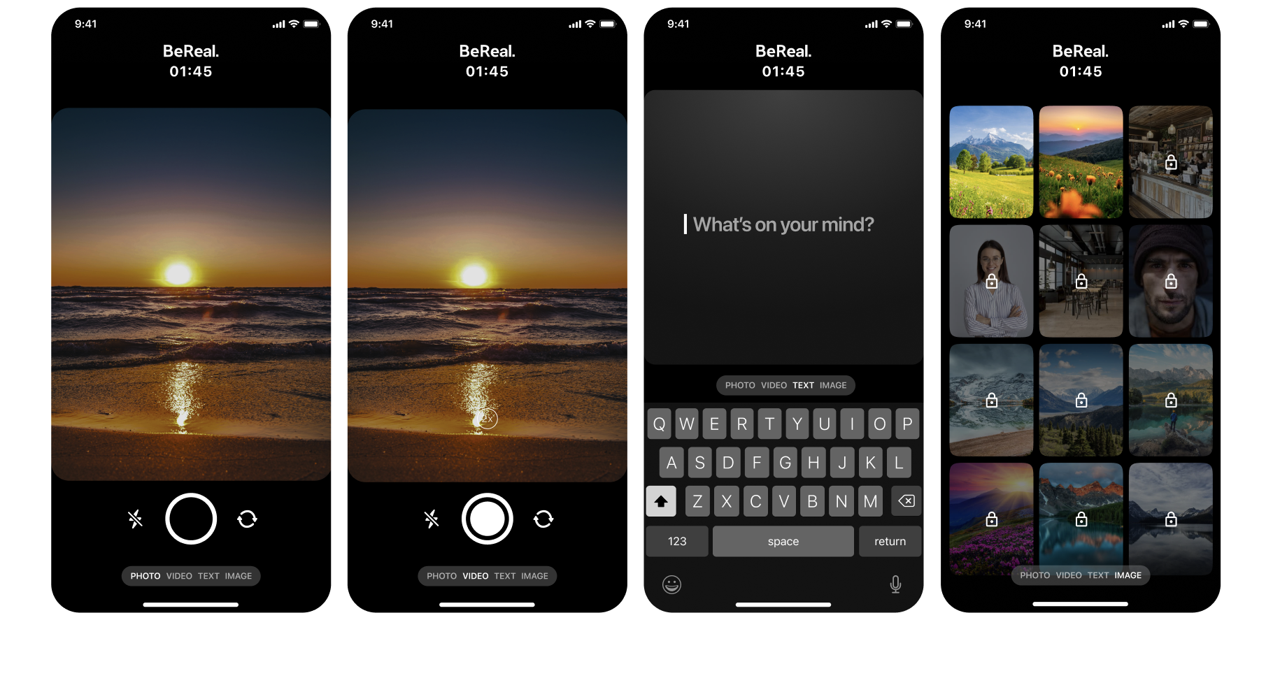
Users suggested adding the option to share a text, if users don’t feel like sharing a video, photo, or image. Additionally, feedback raised concerns about camera roll uploads conflicting with BeReal’s authenticity. The feature was redesigned to only allow photos taken during the notification period.
Final screens
Bringing the Vision to Life: Key Screens
Stakeholder Presentation
Communicating the Story
I had the opportunity to present my findings to a PM and two designers at BeReal. To approach this, I synthesized my research findings, design rationale, and final concepts into a stakeholder-ready presentation
Stakeholders responded positively to brand immersion and attention to detail, however, they encouraged me to focus more on explaining the reasoning behind design decisions rather than describing the interface itself. I incorporated this feedback by refining my case study to better highlight the design rationale and iteration process behind my final concepts
impact + key takeaways
The Ripple Effect
Project Impact:
Proposed features are lightweight, authentic, and encourage engagement without pressure
Iterative research ensured features solved real user pain points
Documentation included a branding kit and design rationale for smooth stakeholder presentation
If I had more time:
Hand off interactions and designs with engineering
Create flows for different content types
Key Takeaways:
Early immersion in brand philosophy ensures design alignment
Paper sketches and early iteration highlight high-value ideas
User-centered design and attention to detail drive adoption

